/* */ Beulah Bee: Liquid Pearls
Showing posts with label Liquid Pearls. Show all posts

December 05, 2022

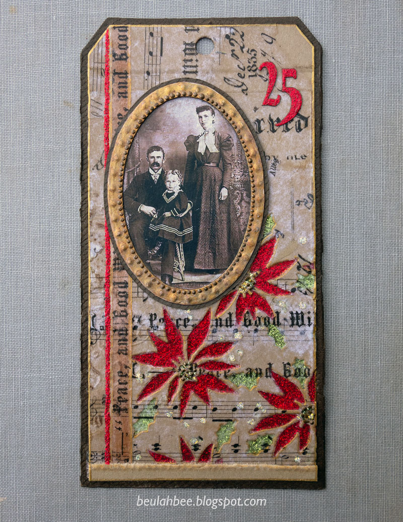
No. 5 for Christmas, 2022

I inherited multiple copies of professional portrait photographs of my great aunts and their relatives/friends (circa 1900-1940) mounted inside thick, tri-fold paper folders. Since I don't need to save, for example, ten copies of a graduation portrait of the same person, I recycle the folders to use in my artwork. That's what makes up the foundations for this tag.

It features a die-cut pattern of poinsettias (Tim Holtz) that were filled-in with Stickles along with a Christmas Collage Paper covering. I used a laser-printed vintage photo mounted inside an old Idea-ology sticker frame antiqued with paint and Liquid Pearls. The numerals were cut from scrapbook paper and covered with Stickles.

I'll share a tip for anyone who doesn't like the unavoidable shedding of glitter--just cover it with a layer of clear medium to seal it. And if you use a matt finish it creates a more subtle, vintage appearance.

I'm linking this one up to Simon's Monday challenge, this week's theme is Holiday Cheer.

As always, I hope this post finds you well and happy and I appreciate your visit.

Until next time, take care.

October 12, 2022

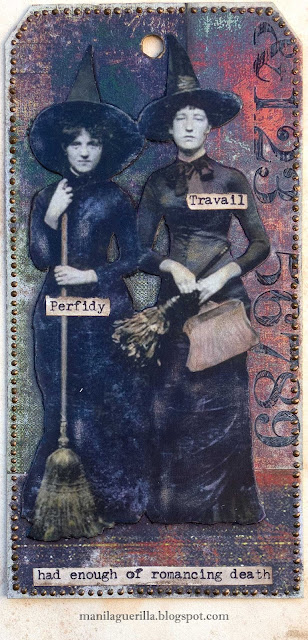
Perfidy & Travail

I'm sharing a tag today that's made with a Found Relative, Remnant Rubs, and scraps of Paper Stash, embellished with Liquid Pearls and typewritten text.

The girls were roughed up a bit with a damp piece of Magic Eraser (perfect to use when a "gentle touch" is best) to lighten their flat black outfits that were then tinted with Pitt Brush Pens.

I also cut out tiny bits, here and there (around their arms, faces, etc.) to improve the factory cutting and make them appear more realistic. A final important step is to paint or ink the edges (I used black) to make the white paper backing blend in with the background (best to do before pasting).

I also scraped through the Remnant Rubs with an Xacto knife to further the distressed look.

I'm linking up to the Simon Monday challenge which is a "Fall Mood Board."

As always, I hope this post finds you well and happy and I appreciate your visit.

Until next time, take care.
December 24, 2021

Christmas Tag No. 7 for 2021

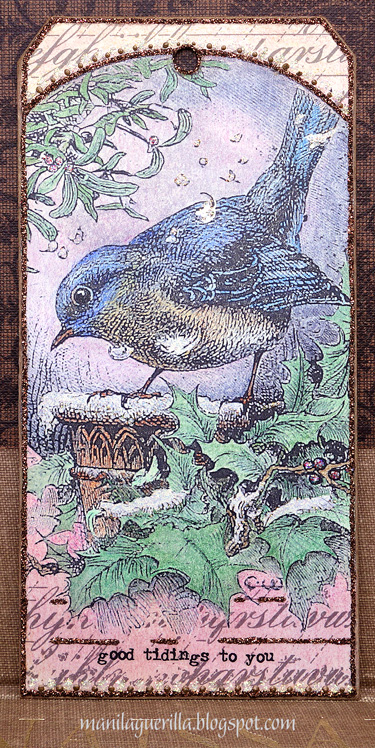
Couldn't help but use an image I stumbled across at the British Library's Photostream for a Christmas tag which I printed on regular computer paper then tinted with colored pencils and watercolor. I stamped the top and bottom to fill-in the white space (Tim Holtz Faded Type) after pasting on heavy-weight kraftstock cut to the shape of a #8 tag.

While it's hard to see, I used a white glitter glue (Stickles) over the snow areas and trimmed the borders with brown glitter and Liquid Pearls. The text is a Remnant Rub.

Merry Christmas Eve, everyone, I wish you the happiest of times with the ones you love.

December 18, 2021

Christmas Tags No. 4 & 5 for 2021

I pulled out all the stops with this tag: Crackle medium, bronze metallic paint, Glossy Accents, Liquid Pearls, Stickles, stamping, a die-cut, and ribbon. It has rich jewel-tones and looks better in person (it was hard to photograph). I made it for Simon's Monday challenge which is "Cold as Ice."

Next up, a tag celebrating Old Saint Nick with an unusual technique that warrants an explanation. The background was a Graphic 45 paper of holly and berries and I laid strips of plaid paper on top then edged one side with glitter. I think it adds to the vintage vibe.

I'm hoping to crank out a few more tags before Christmas and you can be sure they'll include some kind of glitter glue. I've discovered the hard way that once the bottles are less than half-full, no matter if you store them upside-down, they eventually dry-out so I might as well use them!

As always, I hope this post finds you well and happy and I appreciate your visit.

Until next time, take care.
September 17, 2021

Daughter of Atrides

A tag to share made with some Tim Holtz stuff: a Found Relative, a butterfly and a stencil called Thatched.

The Simon September card kit came with some of his Sentiment label stickers that didn't really appeal to me so I used them to cover a manila tag. Then I applied another layer over them using texture paste and the stencil.

I tinted the dress, skin tone and accents using Pitt artist brushes which are made from India ink, are waterproof, permanent and easily applied to the slick surface (highly recommend).

There are some collage bits: the text is from an old book, there's the crown and the flower-like accents (which are actually from an astronomy diagram).

I used some Liquid Pearls along the bottom.

I'm linking up to Simon's Monday challenge--this week's theme is to have "fun with stencils."

As always, I hope this post finds you well and happy and I appreciate your visit.

Until next time, take care.
September 12, 2021

More Sunshine Flowers

This image (from Simon's Sunshine Flowers set) was stamped on hot press 140 lb. watercolor paper and then fussy-cut. The flowers were tinted with dollar-store markers and water. I added some Liquid Pearls to embellish. The die-cut text was layered using three stacks.

I'm linking to Simon's Monday challenge, this week's theme is "stamp it."

As always, I hope this post finds you well and happy and I appreciate your visit.

Until next time, take care.


September 09, 2021

Sunshine Flowers


Simon says "stamp it" this week (no digi images) and it would be nice to use Simon's exclusive products. So that's just what I did.

The stamp set is called Sunshine Flowers and it was part of their monthly kit this month which I decided to splurge on.

I stamped the flower jar on preprinted paper by Lavinia (Scene Scapes Summer Meadow) then cut it out. This way, my flowers and the jar were already tinted.

The background is from who know's where (I've had it for ages); I did some trimming and layering (a portion covered by tissue paper) to create a suitable background for the jar. A bit of a shadow was added to the jar's base.

I didn't feel confident aligning the text (comes with the set) so I stamped it on tissue paper first then cut and pasted it on.

I used the Liquid Pearls that came with the kit to embellish the borders.

As always, I hope this post finds you well and happy and I appreciate your visit.

Until next time, take care.

September 05, 2021

Glimmersmitz

greeting card

A head start on Christmas cards? Maybe. But a call to create with "glimmer and sparkle" at the Simon Monday challenge was really the push for making this one. What's Christmas without some shiny bits--am I right?

I used Pink ombré paper (Martha Stewart) covered with Tissue Wrap (Holtz) trimmed to fit around Poinsetta Pieces die-cuts (Holtz) that were cut from a bronze metallic envelope.

Copper Liquid Pearls, some Stickles, and white Scribbles provided the glitz. I heat embossed the white text and outlined one side of the letters with an extra-fine black marker to create a 3D effect.

greeting card

As always, I hope this post finds you well and happy and I appreciate your visit.

Until next time, take care.

July 21, 2021

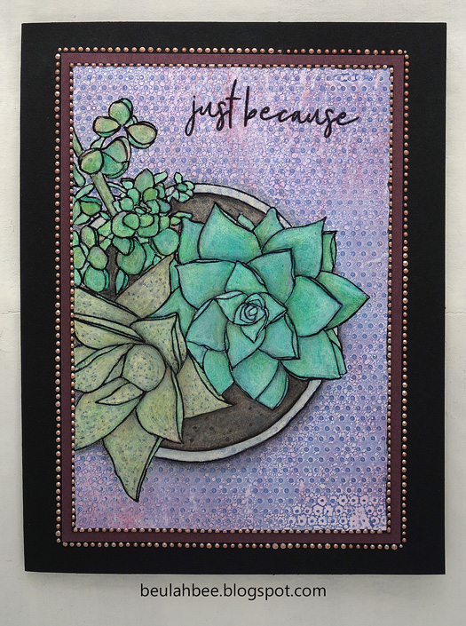
Just Because

Greeting Card

This greeting card features the Mondo Succulent Pot stamp by Ellen Hutson. Back in January, I posted a similar card using this stamp with watercolors (link) and say again how much fun it is to color.

Large stamps make quick work of card making but this time I used a less conventional technique so it took longer. Here's what I did.

The background? It's a print off a Gelli Plate using Simon's Tiny Dots stencil. I "zhuzhed" it up a bit with Distress inks, water and some sanding.

My stamp impression wasn't that great (some lines were too light) so I went over all of them using India ink and a pen nib. It was a good save. ☺

I filled it in with diluted white paint to knock-back the background then used watercolor pencils, inks and regular colored pencils.

I mounted it on dark mulberry cardstock and trimmed it with Liquid Pearls. The text was embossed.

As always, I hope this post finds you well and happy and I appreciate your visit.

Until next time, take care.

December 29, 2020

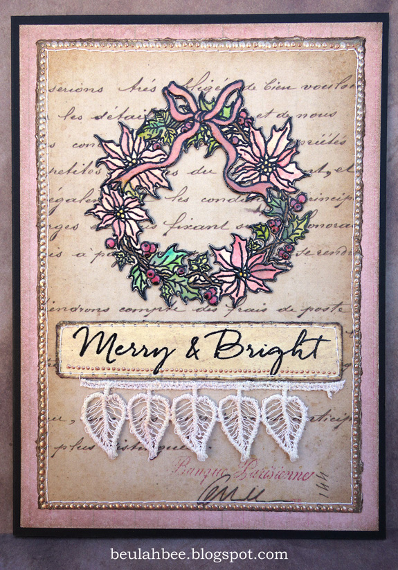
Merry and Bright

 
  • Unless we make Christmas an occasion to share our blessings, all the snow in Alaska won't make it white. -Bing Crosby
  • Remember this December, that love weighs more than gold! -Josephine Dodge Daskam Bacon
  • There's nothing sadder in this world than to awake Christmas morning and not be a child. -Erma Bombeck
  • Then the Grinch thought of something he hadn't before! What if Christmas, he thought, doesn't come from a store. What if Christmas...perhaps...means a little bit more! -Dr. Seuss
  • Christmas is doing a little something extra for someone. -Charles M. Schultz
  • When we recall Christmas past, we usually find that the simplest things--not the great occasions--give off the greatest glow of happiness. -Bob Hope
  • Never worry about the size of your Christmas tree. In the eyes of children, they are all 30 feet tall. -Larry Wilde
Wherever you are, whatever you are facing, whatever your challenges or opportunities may be…may your days of Christmas be merry and bright.

June 14, 2020

Girlfriend


I would say my greeting cards look a lot like the tags I make, or a journal page, for that matter. Here I have assembled one using a hand-cut botanical print, a Found Relative and some Collage Paper (Tim Holtz) onto a book page stamped with a French postage mark. I machine-stitched a border and embellished it with 3D paint (Liquid Pearls).

Everything was tinted with Distress inks and I used a watered-down layer of off-white paint over the girls dresses to change their appearance.


I think a key element in this composition is the addition of dark shading behind the girls which gives it some dimension. And it was mounted onto a kraft paper card base which reinforces the vintage vibe.

As always, I hope this post finds you well and happy and I appreciate your visit.

Until next time, take care.

February 23, 2020

Tell Your Story


I've got this thing about seeing sky inside a frame so I played around with the idea this week and I'm linking this tag to Simon's Monday challenge, "Frame It."

The girl is a Baseboard Doll (Tim Holtz) that I stripped from her backing and you may have guessed that's a flower cut from the Wallflower paper stash.

The frame is a tiny die cut from Stampendous that I crackled with medium, the text is a Remnant Rub and I used Ranger's Liquid Pearls on the inside edge of the frame.


As always, I hope this post finds you well and happy and I appreciate your visit.

Until next time, take care.

September 25, 2019

Fortune Cookies


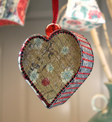
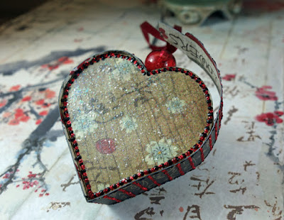
What have I been up to lately? Making Asian-inspired paper-folded Christmas box ornaments that can hold a treat--of course!

It was the project idea I came up with after being invited to a guest spot on the The Funky Junkie Boutique blog. The challenge is "Treats Not Tricks" and here's the description:
  • Choose a theme and make something that will hold a treat for someone.  It could be a Halloween treat bag, a Valentine's candy box, a birthday card for a special person that holds a treat (could be a gift card "treat" or a bite of chocolate), anything that can hold a treat.
To make my box ornaments, I found some patterns here and used the Oriental Garden paper collection by Stamperia and lots of different glitter glues for decoration.

I used tracing paper and a scoring tool to transfer the patterns and quick-dry adhesive to hold them together after folding.

They looked rather plain in the beginning, but the real fun comes when you get out the glitter glue to decorate them. Nothing says Christmas like a little bling ☺!

Ornaments before decorating - click to enlarge


For gift-giving, I can tuck a treat inside or perhaps a note with a special wish or promise (kind of like a fortune cookie). Here are a couple examples of how the boxes open.


I look forward to seeing everyone's projects and encourage you enter the challenge--you might win a guest spot like I did and it's been a lot a fun. Thanks for stopping by!

May 29, 2019

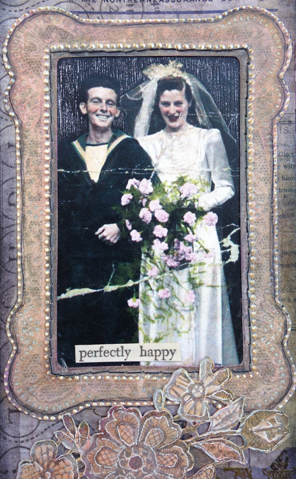
Perfectly Happy


I was inspired by a post at Vintage Everyday that featured wedding photos during WWII and I used one of them for this tag.

It was framed for Simon's Monday challenge this week and also features a Hero Arts stamp from 2007 called Lace Flower Cluster which I used especially for their 45th anniversary Show & Tell Celebration.


After stamping, the lace flower was cut out and embellished with lines from a white Gelly Roll pen. I altered a Tim Holtz lace frame by peeling it from its baseboard backing, trimmed its shape a little and applied dots of Liquid Pearls to the edges. The background was made with Collage Paper.

July 28, 2018

Christmas in July


Simon's Monday challenge was prompted by a special blog hop and a chance to win some crafting goodies, but Christmas in July--really?


While it was hard to "get in the spirit" when we've had record-breaking high temps this week, I accepted the challenge and here's my entry.


My card may be a little unconventional so I thought you'd appreciate a peek at the main ingredients before I applied a wash of gesso and then Distress Oxide (Peeled Paint) to create the background.


It would be difficult to pull this off without using a strong backing so I pasted the collage onto some thin packaging material which would be cut to size near the end.


Some Liquid Pearls (Ranger) were dotted around the oval, the backing was trimmed and then I pasted brown mulberry paper (because it's thin) on the back to frame it. Before mounting on folded cardstock, I stitched around the border.

The poinsettas were cut out of Graphic 45 Winter Wonderland, the bird is from Wallflower and the calendar page is from Tidings (Tim Holtz Paper Stash).

I used a glue stick for everything except the poinsetta (attached using spray adhesive) and the final mounting (double-sided cellophane tape).

June 13, 2018

Precious Things


What to do, what to do...

I can't bring myself to use the papers included in this month's Simon card kit because they are just too pretty! Seriously.

And I couldn't bear to cover up the background of a tag made with a new embossing folder (Tim Holtz 3D Botanical) because it was just too pretty, too!

So I tried to think of a design where I could leave most of it showing and here's what I came up with.


I really played around with distressing the background. I embossed a rather thin piece of pink paper (after slightly damping it first) and then I gave it a coat of Krylon clear matt finish to seal and protect it.

Then I went crazy with gesso, inks, and paints--brushing on, wiping off (and even a little bit of sanding), just to see what worked the best to bring out those glorious embossed details.


Who could blame me for not wanting to cover this beauty up?!

The girls are Paper Dolls (Tim Holtz) and the butterflies came from the Graphics Fairy which I printed in miniature on vellum and then cut out.


Some tiny jewels (tinted with alcohol ink), a scrap of vintage sheet music, a Remnant Rub (text) and a border made with dots of Liquid Pearls were also used.


I tinted the Paper Dolls with transparent acrylic paint and the white of the pearls and lace were made with a Gelly Roll pen. I had a tiny butterfly that was just the right size for sitting atop the little girl's hair bow.

I'm linking this up to Simon's Monday Challenge Blog, this week's theme is Anything But A Card.

Now, what to do about those pretty papers...

December 04, 2017

12 Tags for Christmas 2017 - Peace


One of Tim Holtz's 12 Tags for Christmas 2011 featured Ranger's Clear Rock Candy Distress Crackle Paint and I bought some.

Believe it or not, by storing it upside down it's still good! Granted, it is a little thicker than it once was but I just used a palette knife to spread it over the dove (instead of the brush the paint came with).

Once dry, a layer of white Perfect Pearls was added over the top for a little more sparkle.


The background is an Idea-ology Sophisticate Cabinet Card Frame that I separated from it's backing and aggressively sanded down then stamped with text before cutting it to fit my tag.

I cut a piece of Graphic 45 (Botanicabella) paper to fit inside the oval, added a black satin ribbon along the bottom and lots of tiny drops of Liquid Pearls.


The text was clear embossed but looked a little lost on the background so I used a fine paint brush and white paint to shadow the sides of the letters.  I also thought just a hint of color in the background would do some good so I smudged on a little Fired Brick and Forest Moss Distress Ink and Tag No. 4 was complete.

December 01, 2017

12 Tags for Christmas 2017 - Joy to the World


♪♫ ♪ "On the first day of Christmas, my true love sent to me ..." ♪♫♫♪

Ten years ago today, Tim Holtz began the tradition of blogging about techniques for creating 12 Tags for Christmas and I've continued to make them every year since then to decorate my presents.

This year, I decided to post them in 12 consecutive days beginning December 1st just like he used to do and my first tag features a simple, understated design with an early American or Georgian vibe.

The background is pearly paper with clear-embossed snowflakes (Kaisercraft Frosted) that was tinted with Faded Jeans Distress Oxide.

I coated the book paper die-cuts (Carta Bella Joy Wreath) with Glossy Accents and created additional contrast by using a blue gel pen and a water brush (which soaked in underneath).

I gave the entire surface a wash of dilute white acrylic paint and took advantage of the resist properties of the Glossy Accents by wiping the paint away from the die-cuts where there was overage.


I used a Remnant Rub to complete the phrase and made a frame border with 1/8" silver metallic ribbon (Offray) tinted with off-white acrylic paint.

To age the appearance a bit more, I rubbed on Frayed Burlap Distress Ink here and there and added some Liquid Pearls along the bottom for a touch of Christmas bling.

September 16, 2017

Praesepe


Back in 2011, Tim Holtz introduced a paper stash called Kraft Resist--it's printed on pure kraft cardstock in black with an accent image printed in a clear raised enamel which resists inks, paints, and sprays.

One of the page designs features a map of the world with a resist design of a star-shaped compass and that's what I used to create this tag for Simon's Monday Challenge Blog. This week's theme is "It's Written in the Stars."

I used Seedless Preserves and Mowed Lawn distress stains for tint and embellished it with dots of three different 3D paints in off-white, rose and copper.

The face is a stamp from Paper Artsy and the text was clipped from an old dictionary.